Previous
Branding Project 02


NuFinity was created from the ground up as a modern health and wellness brand with one clear ambition — to build an identity strong enough to grow across multiple product categories without losing recognition.
From the NuFinity master brand to individual product identities, packaging and marketing applications, we developed a flexible visual system that allows every product to express its own personality while remaining unmistakably NuFinity.
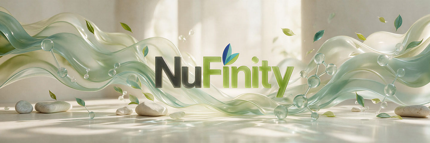
From a single master identity, NuFinity was designed to grow. A flexible visual system allows each product to develop its own personality while remaining unmistakably part of one unified brand family.




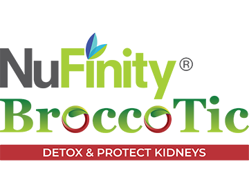


The strength of NuFinity lies in its ability to grow beyond a single product. We established a recognisable master identity that acts as the foundation for an expanding portfolio of health and wellness solutions.
The distinctive typography, colour language and leaf element create immediate recognition while providing enough flexibility for every product line to develop its own character.
SynPro, Iganbo, Uri-D, UbiQuinol and other NuFinity products each serve different health needs, yet every identity remains visibly connected to the NuFinity parent brand.
This creates a scalable brand architecture where new products can be introduced without rebuilding the brand from scratch — strengthening both individual product recognition and the value of NuFinity as a whole.



Each product identity is given its own visual personality while retaining key NuFinity brand elements. The result is a product family that feels diverse without becoming disconnected.
As the portfolio expands, the system allows new categories, formulations and innovations to be introduced while preserving one clear and recognisable brand language.
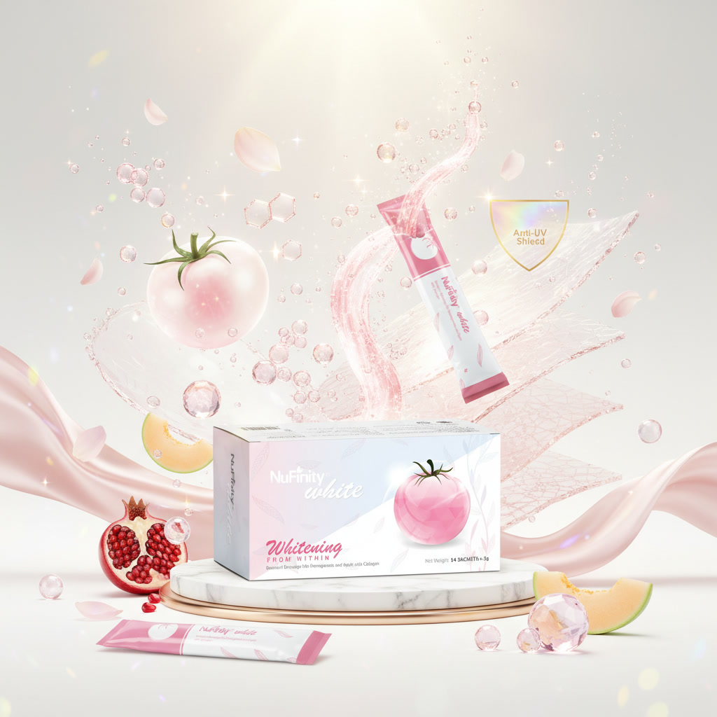
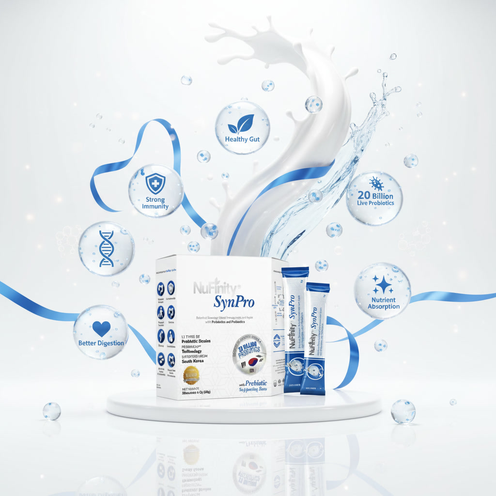
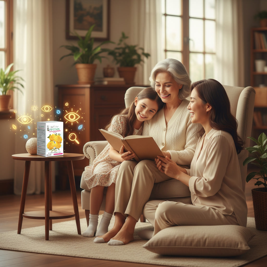
Strong branding is not about making every product look the same. It is about building a clear brand system strong enough to evolve. From the beginning, NuFinity was mapped with a defined visual direction, allowing every new product to develop naturally from one master identity.
Each range can introduce its own colours, graphics and personality to communicate a different health purpose, yet the brand remains unmistakably NuFinity. That consistency across diversity is intentional. It gives the brand freedom to grow, expand and innovate without losing recognition.
See More of Our Packaging Design →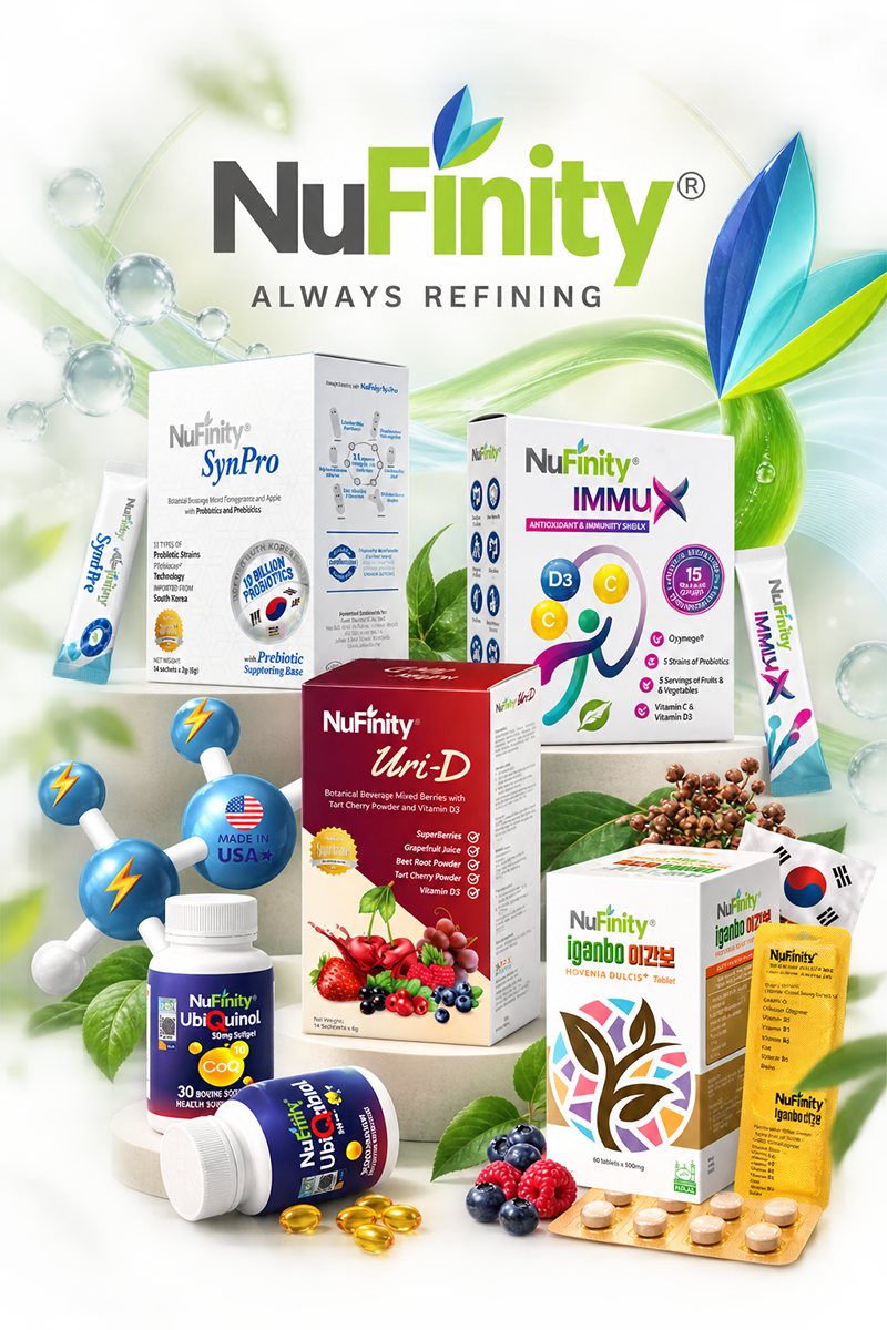
A successful product brand should never become a limitation. NuFinity was intentionally developed as a foundation from which multiple product identities could grow.
Whether the product focuses on probiotics, liver wellness, cardiovascular support, beauty or specialised supplementation, the architecture provides enough freedom to create distinction without sacrificing recognition.
The NuFinity name acts as the visual anchor, while each product is given a carefully developed identity suited to its positioning, audience and category.
This balance gives every product the confidence to stand independently while continuously contributing recognition and value back to the NuFinity master brand.
What began as NuFinity has evolved into a growing ecosystem of health and wellness products. The original branding framework continues to support new products, new categories and new opportunities.
That is the difference between creating a logo and building a brand — one solves today's requirement, while the other creates value for tomorrow.
“A strong brand should never limit growth. It should create the foundation for what comes next.”