

Designed for the People
Who Love Their Pets
Good branding is not designed around personal preference. It is designed around the people a business needs to reach, remember and connect with.

Not Designed for the Owner.
Designed for the Audience.
One of the most important principles in branding is knowing who you are designing for. A successful identity should not simply reflect what the business owner personally likes. It should create the right feeling in the people the business wants to attract.
For Dr. CatDog Clinic, that audience is pet owners. We therefore built the identity around warmth, familiarity and affection for animals, balanced with the professionalism expected from a veterinary practice.
Understand the Audience. Then Design the Brand.
Project Details
Logo Design
Visual Identity
Brand Direction
Brand Applications
Brand Direction
Art Direction
Not Designed
for the Owner.
A brand should never be built around personal preference alone. What the owner likes matters far less than what the audience understands, remembers and responds to.
Designed for
the Audience.
For Dr. CatDog Clinic, the identity needed to connect with pet owners before anything else — approachable enough to feel caring, yet credible enough to communicate professional veterinary care.
Built to Be
Remembered.
Dog, cat and medical care were distilled into one distinctive identity. The result communicates what the brand is before a single word is read — turning meaning into instant recognition.
Building Meaning Into the Mark.




Don't Design for Yourself.
Design to Connect.
A brand exists in the mind of its audience. That means creative decisions should be guided by how customers need to perceive and remember the business — not simply by the personal taste of its owner.
For a veterinary clinic, clinical credibility matters. But so do warmth, trust and emotional connection. Our job was to find the point where all of them meet.
Professional Enough to Trust.
Friendly Enough to Remember.
The visual language deliberately avoids feeling overly clinical. Animal forms make the identity immediately relatable, while the medical cues retain the credibility of a healthcare provider.
Bright green and turquoise add energy and approachability, while the darker supporting tones give the identity enough contrast and structure to remain professional.
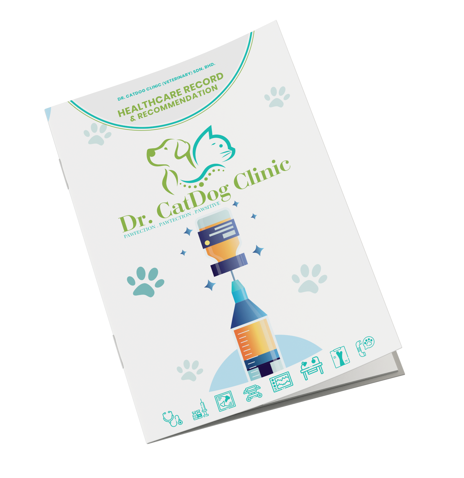
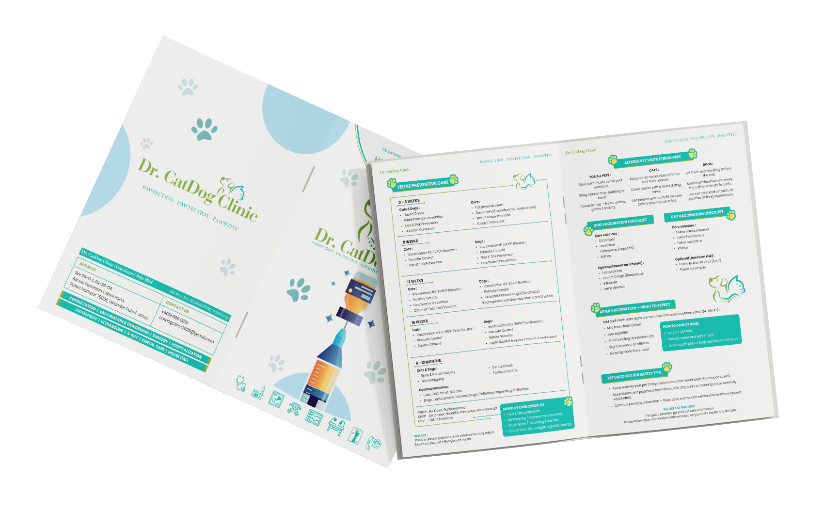
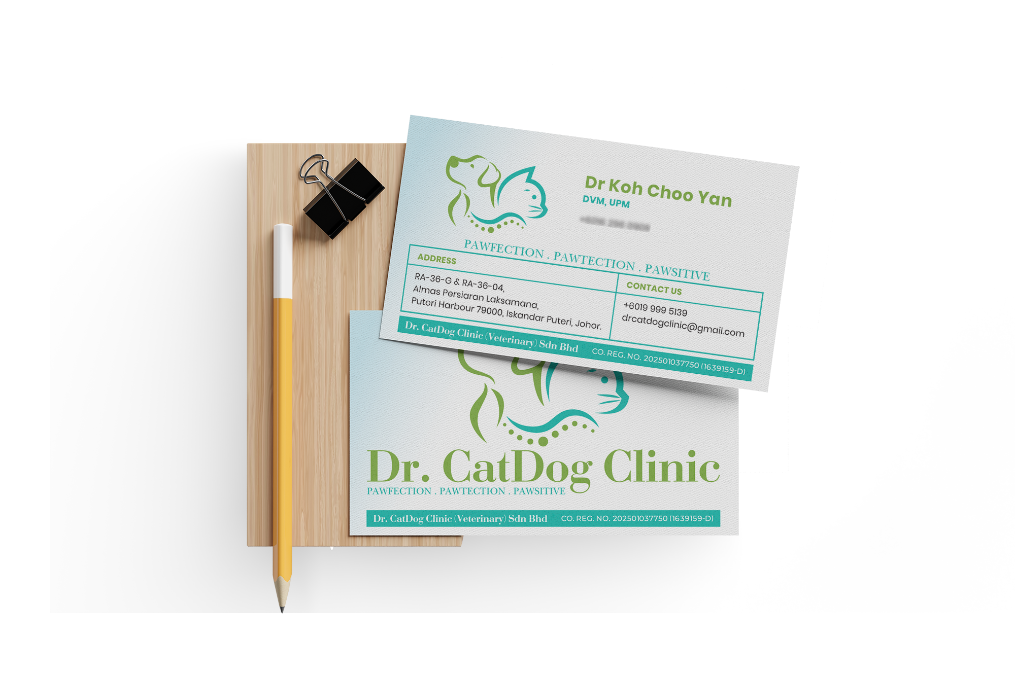
One Identity. Every Touchpoint.
Simple to Understand.
Hard to Forget.
The result is an identity that communicates before it needs to explain — animals, healthcare and compassion brought together in a distinctive visual language.
Because effective branding is not simply about looking good. It is about creating the right impression, for the right audience, and making that impression last.
“A brand should not be built around what the owner likes. It should be built around what the audience will feel, recognise and remember.”